Writing Tips
Elevate your writing and communication with expert articles on writing, grammar, and vocabulary.

Blown Away: 9 Words About Wind
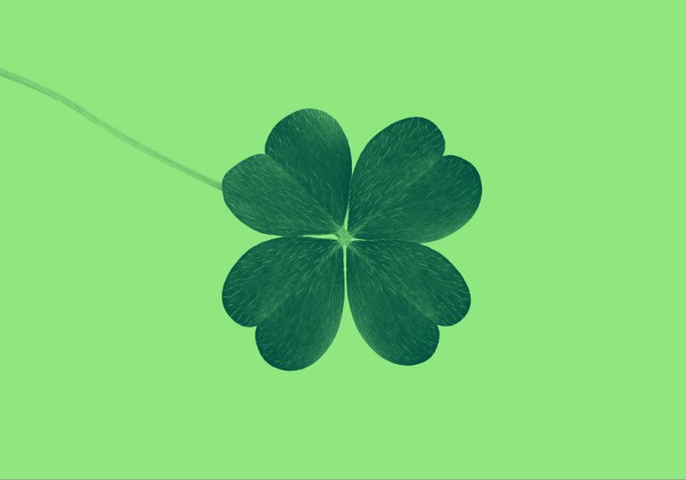
7 Serendipitous Ways to Say “Lucky”
“Thickest Thieves” or “Thick as Thieves”: Which One Is Correct?
Grammar
See more-
“Maximum” vs. “Maximal”: Which One Is Correct, and When?
-

Which Is Correct? “It Is I” vs. “It Is Me”
-

Lust vs. Love: The Heart of the Difference
-

Woman vs. Women: What’s the Difference?
-

Stamina vs. Endurance: Working Out the Difference
-
Is It “St. Patricks Day” Or “St. Patrick’s Day”?
-

Are Seasons Capitalized or Not?
-

Perfect Grammar Is the Accessory You Need
-
Make Your Writing The Star Of National Grammar Day With These Tips
-

Is It “President’s Day,” “Presidents Day,” or “Presidents’ Day”?
-

Is It “Valentine’s Day” Or “Valentines Day”?
-

When to Capitalize “President”
Synonyms
See more-

Let’s Clear the Air About Sky vs. Firmament
-

When It Comes to Approval, Should You Praise or Lionize?
-

Best Wishes: The Difference Between “Hope” and “Aspire”
-

Is That Food Yummy or Palatable?
-
Let’s Clear Up the Difference Between “Confuse” and “Obfuscate”
-

Are You Driving Down a Street or Thoroughfare?
-

Sweet Talk: Candy vs. Confection Explained
-

Is It Messy, or Starting to Look Unkempt?
-

“Begin” vs. “Undertake”: Let’s Go!
-

Are You Bold or Audacious?
Ways To Say
See more-

A Flamboyance of Flamingos and Other Brilliant Bird Group Names
-

Emotional Words We Should Have in English
-

Unusual Wedding Words for Your Next Celebration
-
“Slave” vs. “Enslaved Person”: What’s the Difference?
-

12 Strange Names for Baby Animals
-

British Terms That Flummox Americans
-
“Font” vs. “Fount”: When Do You Use Each One?
-

C’mon, Get Happy: 7 Happy Idioms and Phrases Defined
-
“Beeline” or “B-line”: Which One Is Correct?
-

Shades of Green: Where We Got These Colorful Words
-

10 Commonly Misused Words
-

Blown Away: 9 Words About Wind
Writing
See more-

What Does “[sic]” Mean in Writing?
-

“Beeves” and Other Plural Words You May Not Know Existed
-
These Literary Adjectives Have Real Character
-

16 French Loanwords That Add Some Panache to English
-

What Are the Different Types of Sonnets? A Guide to Famous 14-Line Forms
-

13 Essential Literary Terms
-

How to Write a Scary Story: Tips to Haunt Your Readers
-

How to Use Wordplay to Elevate Your Poetry
-
How to Use Wordplay to Elevate Your Poetry
-
How to Write a Haiku: Tips and Examples
-

The Power of Poetry: A Beginner’s Guide to Writing Poetry
-

How to Write a “Get Well Soon” Message